Synopsis

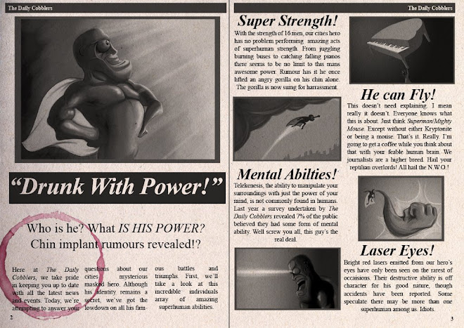
Drunk with Power tells the story of a confused young man suffering a debilitating hangover; that is until he discovers he has superpowers. In three minutes, our protagonist arrogantly flaunts his new found superhero abilities to a small crowd of onlookers but in turn discovers a terrifying truth about himself.

Sunday, 25 January 2009

Graphic Aesthetic Experiments

This pair of images are small tests, experimenting with graphic stylisation in my coloured layouts. The images themselves are not layouts from the film, but were mocked up so that I could clarify colour, texture and composition. As my film progresses I will create layouts that compliment the story through colour and style, using this to emphasise the plot.


Obviously, this is a stylised impression of scenes occuring in the sky. Because of the long focal distance in some shots, I want the layouts to retain interest and create a good sense of scale. Clouds will be paralaxed, though only slowly so as not to disrupt the composition.


This lineart for this image was created pretty quickly, so doesn't have the final layouts level of detail. Also, the perspective's pretty broken, it looks like something from Blade Runner and the composition's sloppy, but stylistically, I'm pretty happy with it! Masking lineart in photoshop means it can be coloured to compliment its contents, something I may use on animated elements if time permits.
Saturday, 24 January 2009

More Cel Shading


Further character pose experiments, trying to emphasize perspective but keep everything relatively under control. Colour mock up for fun, lighting boundaries marked on pencil drawing before scanning, makes painting more straight forward.

Wednesday, 21 January 2009

Cel Shading


One possible method for colouring frames, pleased with result but realistically far too time consuming. Colour pallet is preliminary, although I quite like it. Will attempt some vector based fills next, hopefully will eliminate work time. Lighting in images is pretty dynamic, won't always be so melodramatic. Colours in layouts may also effect overall hue.

Tuesday, 20 January 2009

Our Hero Develops...

Further design ideas for lead character; slowly but surely this is nearing completion.

The images above are based loosely on the character's design from my animatic, but anatomical adjustments have been made. Now he has a forehead!


Decided fairly quickly that I'm going to lose the crazy hair, mainly due to its lack of form and demanding need for secondary actions. As a result he's been left bald - still considering a beard and bedhead combo.


Studying form lead to another possiblity, giving him a mask, The Phantom style. These designs are much closer to what I've aimed for, flexible but solidly constructed. A little concerned he may be losing his hungover edge, but hoping he acheives a hybrid animation/comic aesthetic.

Friday, 16 January 2009

Secondary Character Scribblings

Although I was initially uncertain about their suitability in the finished animation, the secondary characters featured in the animatic may not need to be replaced. Generally, they've received positive feedback, despite simply being blobs with smiley faces. So long as they retain a look that doesn't disrupt the aesthetic of the rest of the animation, I'll leave them as they are, but this may require foreshadowing e.g. in pictures in the newspaper article.

Here's a couple of sketchbook pages experimenting with said emoticon-esque persons. The colour test on the second page is only preliminary; in retrospect I'm adverse to giving them garish yellow faces.


One major advantage to this overly simplified/stylized design is that it'll allow me to animate a large number of these characters in a much shorter amount of time than something more complex. Considering they'll be in small crowds, this is very useful.

Character Development

This post is comprised of a number of pages from my working sketchbook, illustrating the development of my films lead character. I'm not entirely happy with his appearence in the animatic, although as it has progressed, so has his design.

My main concern is to keep him appealing while ensuring his design is solid i.e. does not change drastically as the film progresses. However, this doesn't mean I want to create something completely prescriptive, but more a design based on readable forms and construction.

I've left page annotations on the images because they save some explanation, although there's a lot of left over rubbish.

After looking at Heroes for visual influence, I studied their characteristic eyes.


Having established a number of general principles for draughting the eyes, I turned my attention to the construction of the head itself, attempting to keep it as simple as possible to increase its ease in drawing. An influence from animation of the 1950's encouraged this.


Although I liked the way these designs were developing, paying more attention to accentuating perspective and simplicity, they consequently began looking very simlar to Samurai Jack. Likewise, I thought the overall appearence was looking too rigid, almost anime esque i.e. I wasn't having fun.

This became increasingly apparent.


The design was becoming too flat, with features that appeared stuck onto the construction rather than being a part of it. The effect makes the character look like something from Thomas the Tank Engine.


Because of this I have considered the overall structure of the face from a more anatomical stand-point in order to reduce this effect. Although it may initially complicate the design, I'm hoping that it will allow me to compromise with something functional, but versatile and funny.


This has also allowed me to tackle another part of the design that had confused me - the chin. From studying the skull, I can now render a mighty chin worthy of any superhero.

My epic character design journey continues...