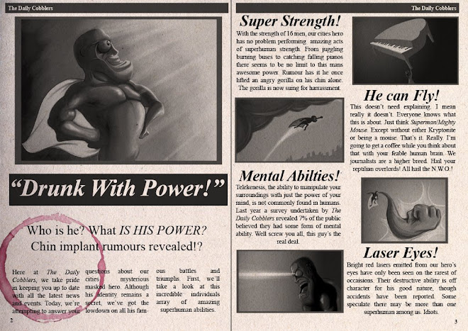
Its probably worth noting for the record that I'm not a great fan of comics/superheroes etc, but the idea to create a film based on this genre came more from wanting to show its rediculousness as a theme.
 Basically, this sorta stuff has me in stitches.
Currently, I'm reading Alan Moore's Watchmen in order to understand more about the genre. Lucky for me, the graphic novel supposedly "revolutionised" comic books by defining a much more realistic approach to the genre, something I have attempted to relate to in my screenplay.

Visually, I'm really impressed by the novels clever use of colour to emphasize the sickly, neon lighting that fills most cities.

Panels are filled with large amounts of dynamic light and shade to emphasise the action and the scene's atmosphere. Character poses can be read even on a small scale due to their strong silhouettes. Awesome.
Although this style can be easily read, its hard to say if it would translate well to animation without the aesthetic becoming too "anime".
Speaking of which, Katsuhiros Otomo's Akira is loaded with great, dynamic character poses and visual effects.

 Like Watchmen, colours are often massively over-saturated, but here only during scenes of intense action. I guess that way, the film's 1½ hr screen time won't melt a viewers eyeballs.
Plus, anti-hero Tetsuo wears a cape for the latter part of the film. Although iconic to superheroes, a previous attempt to animate a cape was insanely time consuming, and may be out of the question.
Conversely, John K's Ren and Stimpy contains my favourite superhero character, "Powdered toast Man". He doesn't wear a cape.


I love the character's rediculous, overly-macho appearence. His poses have strong lines of action that really help accentuate visual gags, but his form remains consistent, so that action isn't unreadable. Plus, his head's made from two slices of toast.
 Each frame is really carefully inked, in so far that it helps describe form and perspective. Some outline's colours also correspond to their parent, like his tongue.
Although I want my story to be "believable", that doesn't mean it'll be visually realistic. I'd much prefer to create something either cartoony or abstract than to mimic reality.
Why?


