

The coherence of the lighting needs to be addressed, the top image is definately too bright compared to the first (in previous blog). Also, the doorway in the second image will be brightened, though I like the contrast it creates. Lastly, the top layer of paper in the stack is different between the two bottom images, I'll fix this too.
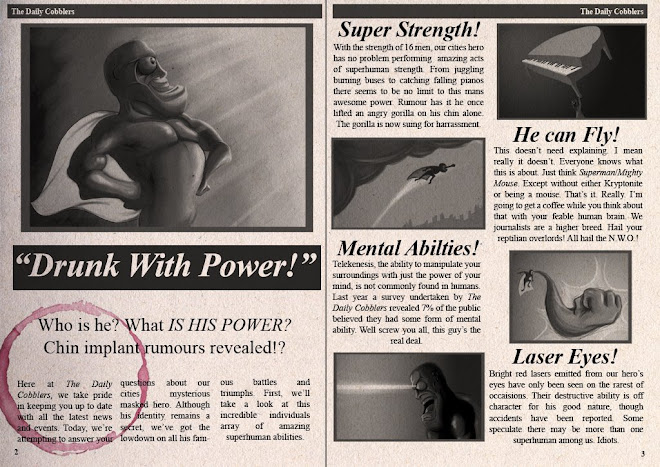
AND, I need to put something on the newspaper to make it a newspaper. Otherwise its just a stack of paper. Which is bad. Yeah.


2 comments:
yeah the contrast of the doorway with the light looks awsome. keep it i tells ya!
Looks wicked Robinho, really cool aesthetic!
Post a Comment