Synopsis

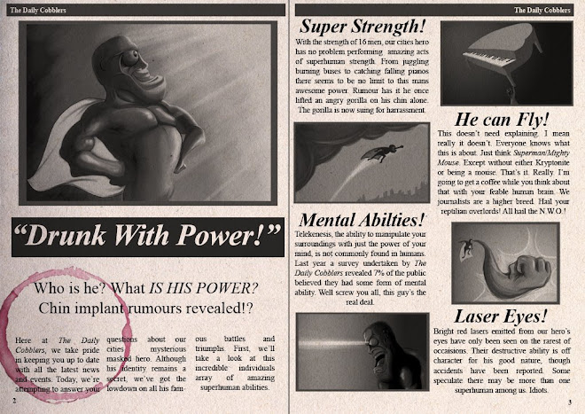
Drunk with Power tells the story of a confused young man suffering a debilitating hangover; that is until he discovers he has superpowers. In three minutes, our protagonist arrogantly flaunts his new found superhero abilities to a small crowd of onlookers but in turn discovers a terrifying truth about himself.

Saturday, 28 February 2009

CityScape

A little experiment, about an hour to mock this one up. Still uncertain about layout design for shots of the city, created this washy approach as a test for this part of the film. Needs more detail/contrast, this one's probably about half complete, but its conveniently simple and wouldn't take much time to colour a bunch of layouts this way.

EDIT: Continued work on this image, bigger palette, more detail. Still not happy wiff eet.


EDIT The Second: Small adjustments to lighting, we'll call this good enough


.
Sunday, 15 February 2009

Pub!

Last one of these I'll post for a while, got some serious amounts of animating to be decimated, so colouring layouts moves lower in the order of things. Pleased with this one, took too long and my eyes are bleeding, but it'll do.

Debris from ceiling will be animated to floor in case anyone wonders where all the ceiling went.

Thursday, 5 February 2009

Opening Sequence Layouts

Figured I'd post these now before I call them complete, just in case I've missed anything. Conveniently, the opening 30 seconds of my film only require these 3 layouts plus the other from my last post; here's where they're at.


The coherence of the lighting needs to be addressed, the top image is definately too bright compared to the first (in previous blog). Also, the doorway in the second image will be brightened, though I like the contrast it creates. Lastly, the top layer of paper in the stack is different between the two bottom images, I'll fix this too.

AND, I need to put something on the newspaper to make it a newspaper. Otherwise its just a stack of paper. Which is bad. Yeah.

Sunday, 1 February 2009

Refined Aesthetic

A little work in progress image, the film's first shot digitally painted. As previously mentioned, my approach to layouts will depend on their place in the story i.e. as it unfolds, their design will reflect its intensity.


In this case, the atmosphere is pretty mundane. The lead character will be lying almost dead central in the frame, looking pretty worse for wear. Small details still need to be added, such as decorating posters on the walls and defining edges, but these can wait for the moment. Hopefully the time required to produce these images will balance itself with other layouts simpler graphic approach as demonstrated in my previous post.